Sticky: Designing a home for the links worth keeping
I save things constantly, whether it’s the article I mean to finish later, the thread worth keeping, the occasional piece that genuinely shifts how I think. And then, when I need it most, I can’t find it. The pattern was always the same. I’d be deep in a conversation weeks later and reach for the perfect piece on exactly what we were discussing, certain I’d read it and certain I’d saved it, and then I just couldn’t produce it. For years my system was to add a pile of links into various Craft docs whose page names I had to remember, which really wasn’t a system at all. Yes, the links were safe, but I had a hard time finding them. And a link you can’t find is the same as a link you never saved.
Every product starts with a pain you want to address, and a weekend fix turned into a small bet on how knowledge work changes once agents are doing more of it. It went from a vibe-coded prototype to an opinionated product, and it taught me a few things about designing for and with AI along the way.
An itch to scratch
The first version took an afternoon. I one-shot the interface with a Supabase backend that stored each article, and used GPT-4o-mini to help auto-categorize it on the way in. That last part mattered more than it sounds, because categorizing was always the step I hated, and any tool that depends on me doing the boring part is one I’ll eventually abandon. My kids named the app, as I discussed it with them on a road trip to Quebec City. They threw out a bunch of ideas and “Sticky” fit immediately. Sticky would be easy to save, easy to recall, and easy to read, and a name that could comfortably live in an AI-native world.
Good enough to live in
The longer I used Sticky, the more I wanted it to be more than a bucket I dropped links into. That ambition came with a constraint that ended up governing every decision after it. For me to keep using it, I had to actually want to, and if I didn’t use it, it would never learn anything about me. We’ve all installed the read-it-later app that quietly became a graveyard. Those die not because saving is hard but because nothing ever pulls you back in, and the pile of links grows until it’s easier to abandon it.
The whole game is signal, as every save tells the system what you keep, what you skip, and what you keep circling back to. Even saving something for later is its own small vote about what your future self will care about. But you only get any of that if the product is good enough that you actually live inside it.
Better input governs better output, and the only way to earn better input is to build something people genuinely want to return to.
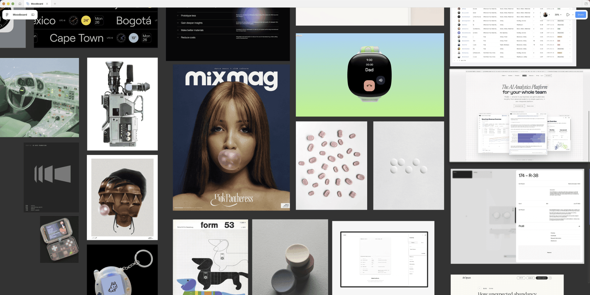
So I stopped vibe-coding features and started making real choices about what the product was for and, just as important, what it would refuse to be. It turned into something assertive and curated, less an app than a position on how this kind of tool should feel. The visual language had to be something that was modern, with a retro nod, and an editorial flair.
Give the AI a vocabulary, not a vibe
There’s a trap in any workflow where you build fast with AI. Speed comes nearly for free, but consistency does not. Ask a model for a clean card ten times and you’ll get ten subtly different cards, each one fine on its own while the whole thing quietly comes apart. The interface starts to feel like it was assembled by ten designers who never spoke to each other.
I defined the primitives and tokens first, including the spacing scale, the type ramp, the colour roles, and the core components. It’s the visual vocabulary the model had to build with. Rather than describe the look I wanted on every pass, I let the design system set the guardrails and the AI assistant compose from a fixed set of parts. While I designed some reference screens in Figma, once there was a strong foundation, it became about direction instead of determining where every pixel lay. A model given a vibe will improvise, so I gave it a vocabulary to limit the drift.
Links as the atomic unit
Underneath all of this is a bet about the right unit to build on, and mine is that the link is it. We don’t need more knowledge workspaces, the cross-purpose apps that bolt together tasks and docs and chat and then force you into someone else’s mental model. We don’t need another social feed either, since those optimize for recency and engagement, so the links that matter most to you get buried the fastest.
What we actually need is a better place for a person and their agents to share a brain, and a link is the most honest atomic unit for that. A unit small enough to capture without friction, yet rich enough to carry rich context. Sticky treats every saved link as a first-class object rather than a dead URL in a list. That’s the whole difference between a bookmark folder and a corpus an agent can actually summarize, compare, and chain into real work.
Drop a link into Sticky and you’re not just saving it, you’re teaching your future agents what matters.
Sticky is being built for people who already live this way. The designers, PMs, founders, and researchers who treat the web as a core part of their craft, and who feel that existing tools either over-index on social feeds or over-serve with heavy knowledge graphs that become their own second job. The volume of links worth keeping has exploded while the tools for keeping them have mostly gotten worse, and this wave of AI can finally summarize and reason over a personal collection, but only if that collection is clean and structured.
Three ways back in
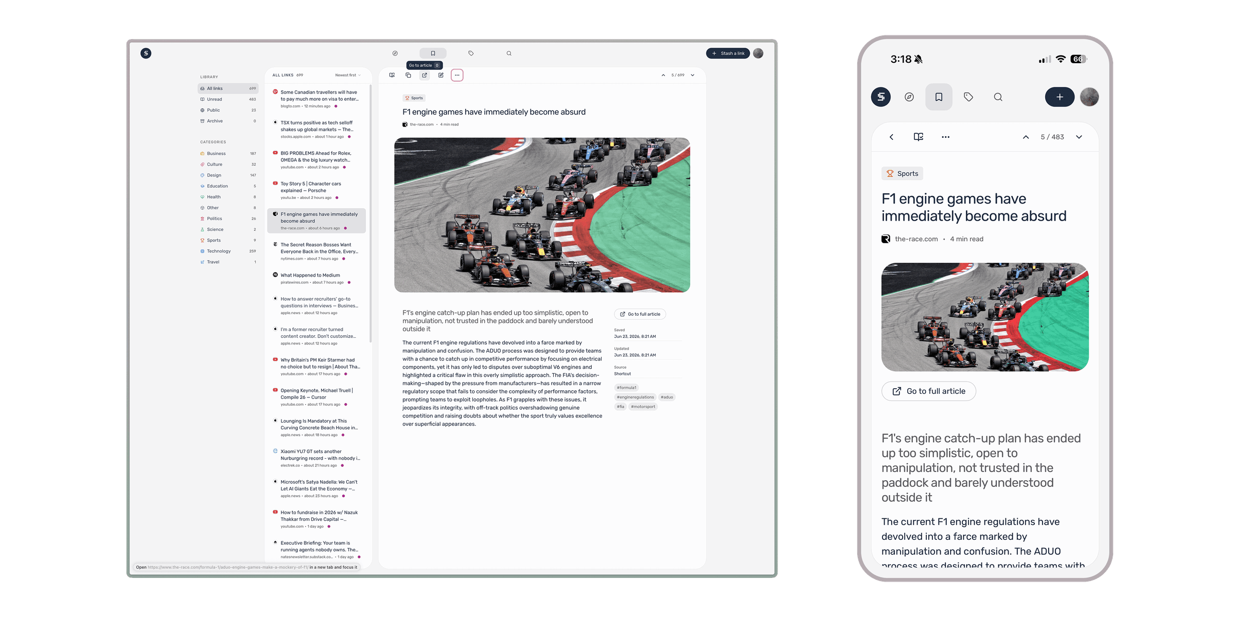
In v1, that conviction narrows to three ways back into your own collection, each one earning its place by giving you a reason to return.
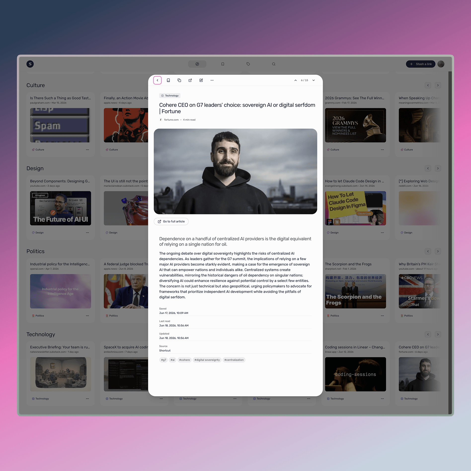
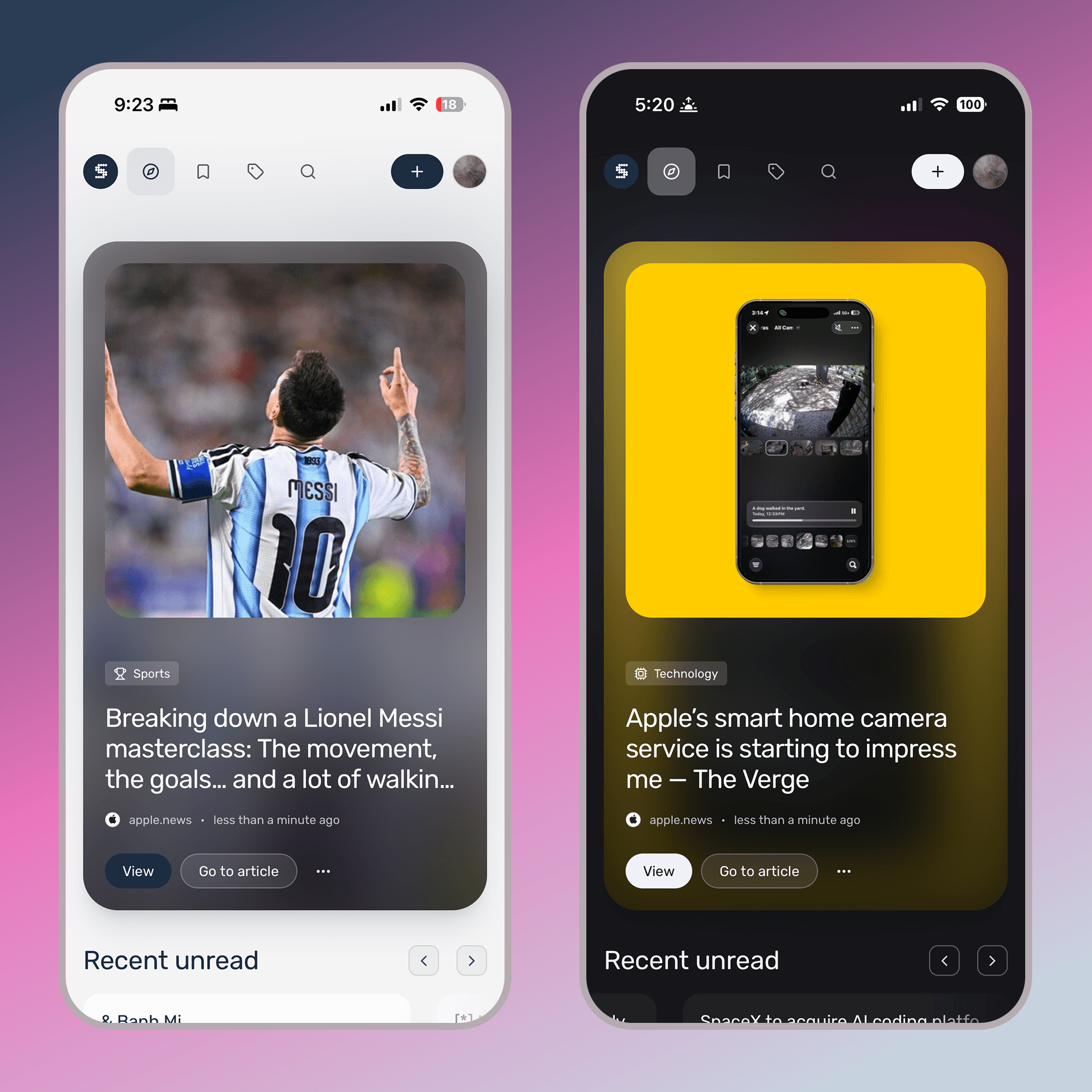
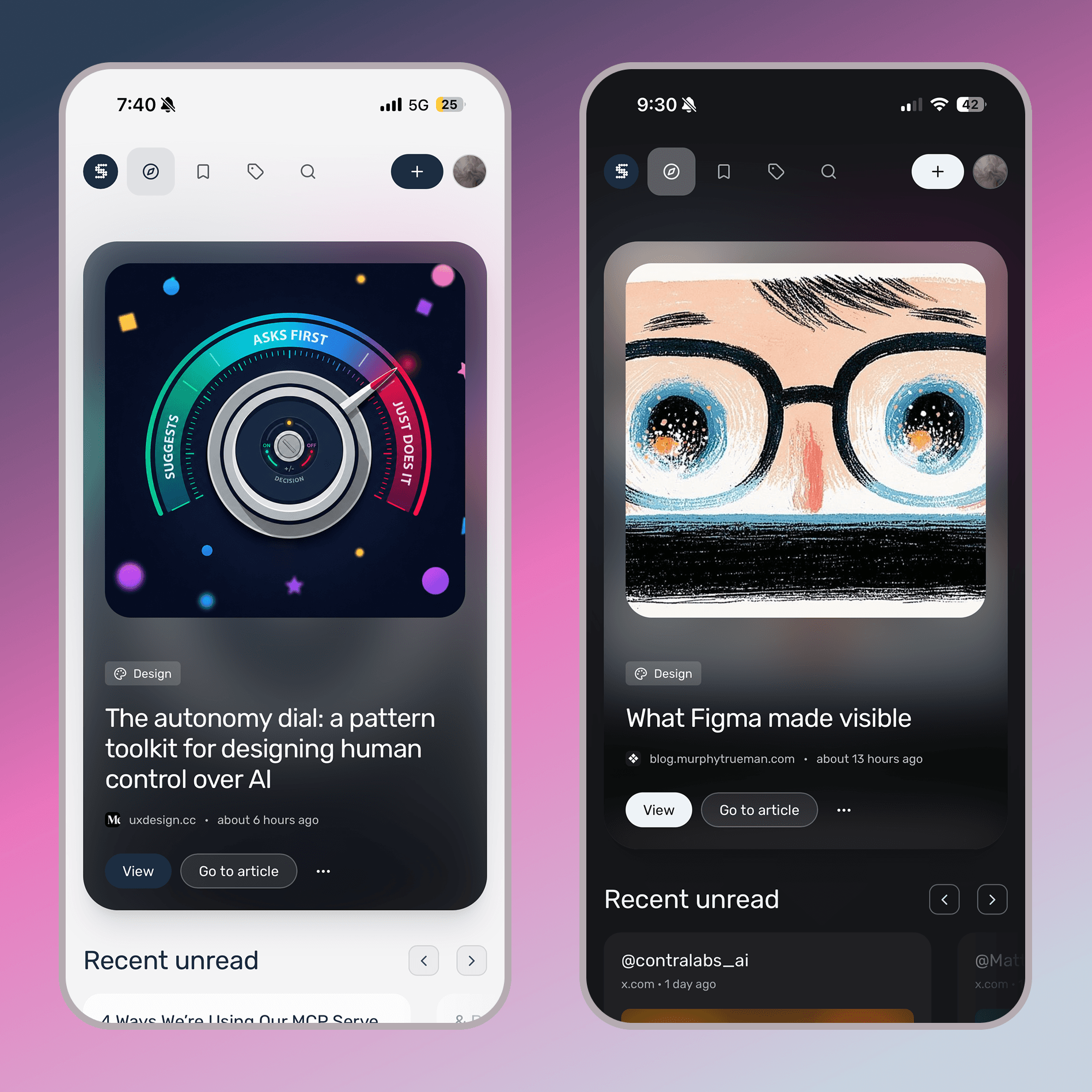
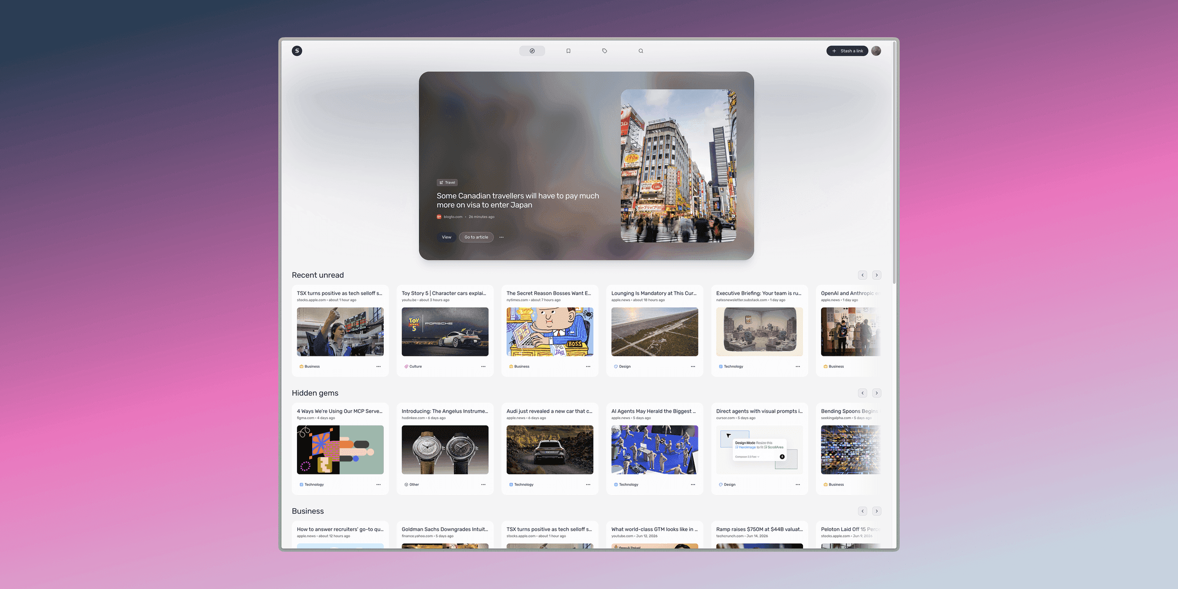
Discover is for reconnecting rather than just consuming, and it opens the way a streaming app does, with one thing in the spotlight and everything else on shelves below. That spotlight is the hero, and it’s the newest thing you haven’t read yet. The logic is deliberately dumb in v1, where the most recently saved unread link simply wins. The moment you finish it, the next one slides into its place, so the page rewards you for clearing things instead of guilting you for the backlog. Each hero even carries its own color, an aurora gradient hashed from the link itself, so the same piece always wears the same sleeve, like album art. Below it, Discover surfaces your recent unreads alongside the hidden gems buried in your crates and whatever’s resonating in the categories you tend to collect, deliberately a little randomized. You never really get to everything you save, and an old goodie resurfacing at the right moment is worth as much as anything new.
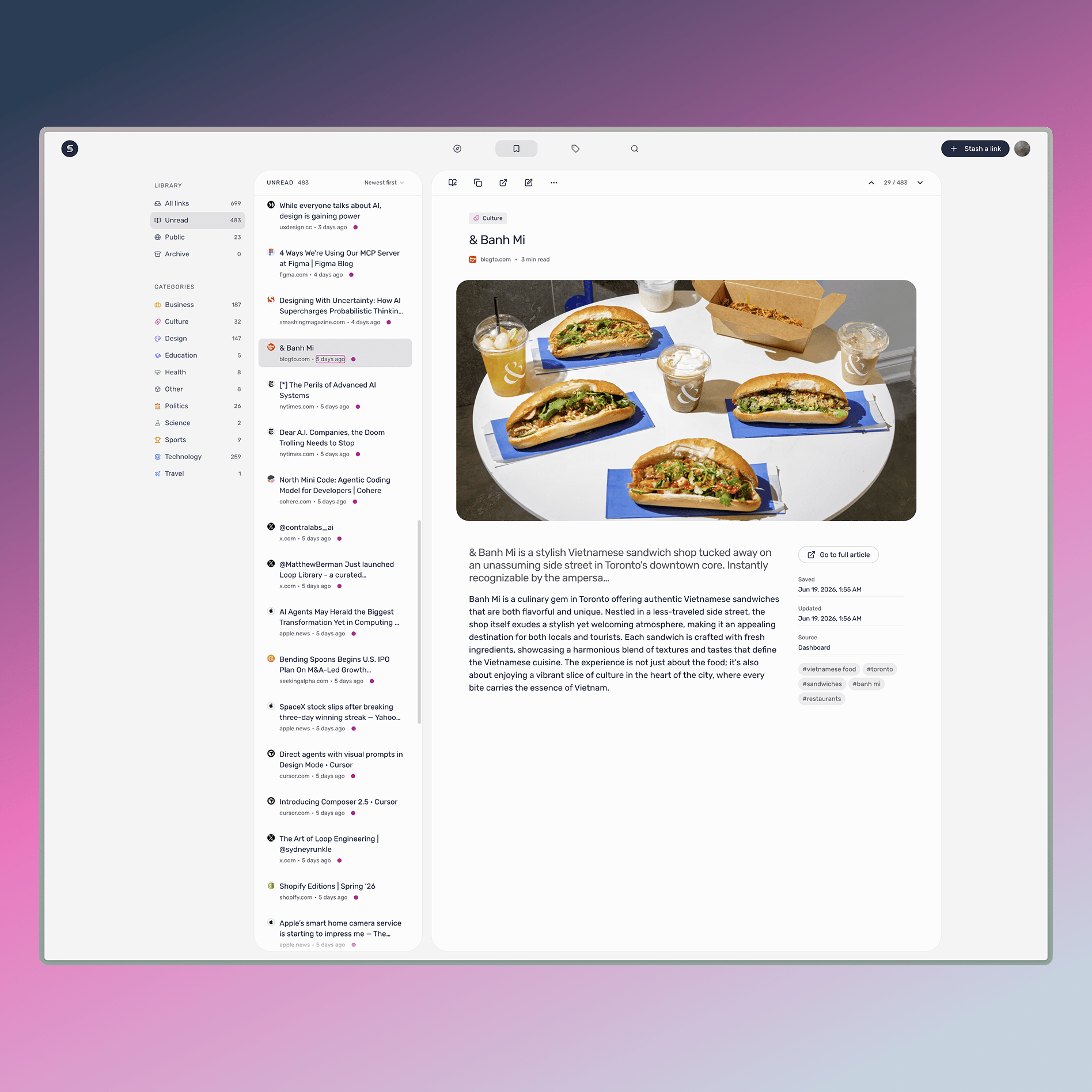
Library is the home base: every link in reverse-chronological order, defaulting to your most recent unreads, with fast filters for when you need to sort straight down to the one thing you’re after.
Search is for the half-memory, that certainty that there was a perfect piece on this once even though you can’t recall its title or where you read it. It’s the quickest way to pull it back the moment you’re mid-conversation and need it, which is the exact failure that started this whole project.
Three doors, all opening onto the same job — making Sticky somewhere you genuinely go.


Made for reading
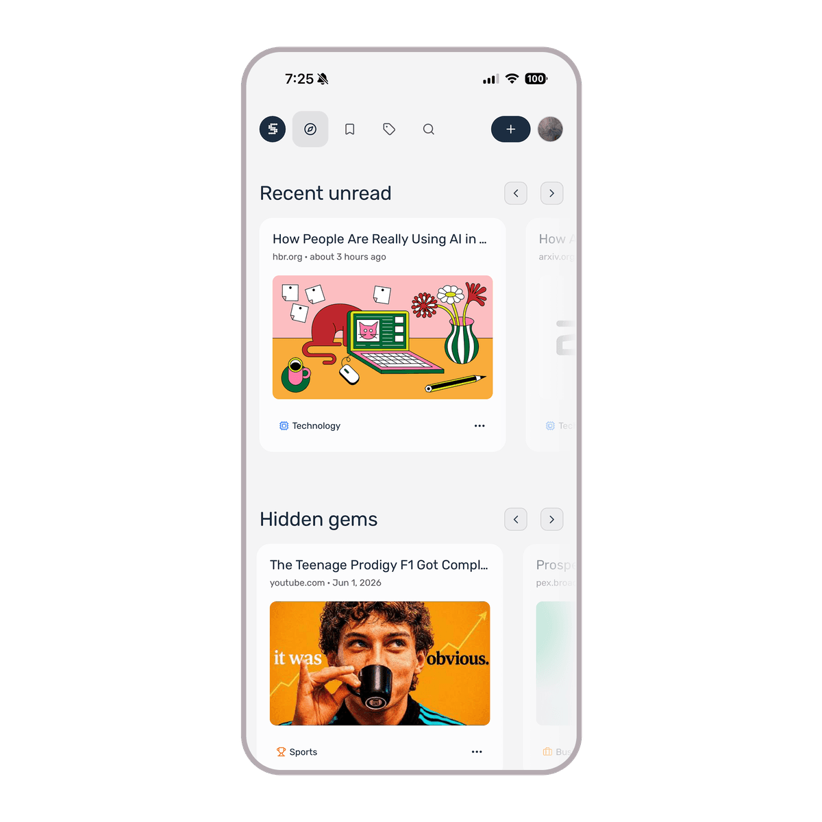
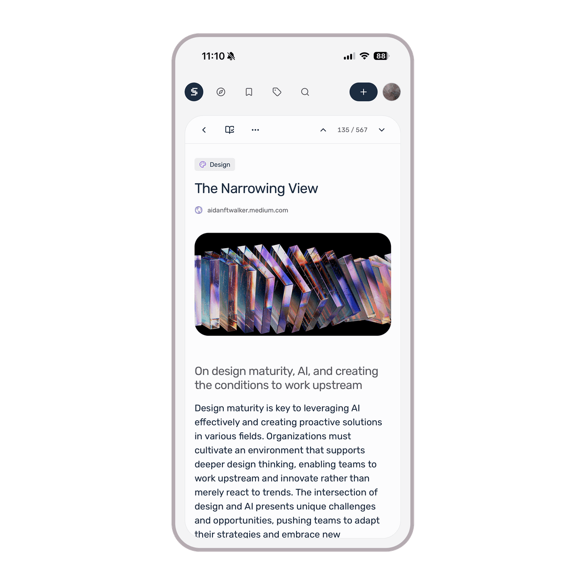
Finding a link is only useful if you actually read it, so the reading experience carries more weight than it first appears. A cramped or ugly reader is one you quietly avoid, and a reader you avoid turns Sticky right back into the graveyard I was trying to escape. So the in-app reader is clean and unhurried, tuned for sitting with a piece rather than skimming past it, and it ships with a real dark mode. A lot of reading happens late, on a phone, in bed, and a screen blasting white light at eleven at night is how good intentions die. I wanted Sticky to be more comfortable to read in, to encourage more reading, more saving, more visits, which is exactly the info the rest of the system runs on.


From a library to a research team
The reactive product is only half the bet, it mostly exists to earn the half that comes after. Once you’ve curated a private, high-signal corpus, the bottleneck stops being whether you can find more information (in Sticky you always can), it becomes something else.
The bottleneck isn’t finding more information anymore, it’s whether your agents can work from the right information, with the right context, on your behalf.
That changes the shape of the product. Instead of saving a URL and hoping you remember it later, you express intent at a higher level and let the agents on top of your library do the legwork. You might tell it to keep a running brief on a project, then open Sticky each Monday to a short synthesis of what’s new and relevant, the contrarian takes called out because you asked for them, the one piece you’ll most want to read pinned to the top. The interesting design problem there isn’t another wall of filters and toggles. It’s the trust contracts that keep you in control. It's being able to ask why something got surfaced, and to tell it never use that source again, or to tighten and loosen the net as your interests move.
In v1, the agents stay deliberately humble. They observe, summarize, and recommend, without ever autonomously rewriting or deleting your repo, because trust has to be earned long before autonomy is handed over.
Why the experience still matters
It would be easy to assume that in an increasingly agentic world the interface matters less, that once the agents are good enough the surface they sit behind becomes an afterthought. I’ve come to believe the opposite, the experience is exactly where the signal comes from the user. And getting there means building a rich experience for both human and agent to work together. As the experience evolves, I’ll spend more time on tracing and observability that let me measure whether the results are improving and tune them when they aren’t, alongside the design work of making everything the agents do legible and explainable.
The goal was never for AI to think for me, it’s to hand back the hours I spend hunting so I can spend them thinking.
The best ideas are supposed to stick and Sticky is my attempt to keep them within reach. A quiet, opinionated tool that’s still genuinely worth using when the agents arrive, and good enough at the human end to be trusted as the source of truth at the agent end.
v1 is still rolling out in stages, not landing all at once, each step shaped by how the last one actually got used. That’s the thread I’m carrying into v2, where the agentic features begin. The agents will work across your whole library (running briefs, surfacing insights, curating your collection), but they come second on purpose. The tool has to earn its place first, because a person has to use it and trust it before any of that is worth handing off. I want Sticky to move from being a place you store links to the place you start to frame your thoughts.